
As a front-end developer, you are likely to understand the necessity of a UI library to build React projects properly. With several options available with distinct advantages and disadvantages, this article will compare two of the most commonly used React libraries: Ant Design vs Material UI.
Ant Design and Material UI are powerful, open-source libraries that simplify the creation of high-quality user interfaces. With their comprehensive set of pre-built components plus a large community of devoted developers backing them up, these two have become go-to tools for React applications.
We’ll compare these two libraries in terms of their design principles, components and features, customization options, and performance and scalability. We will also discuss use cases for each library, as well as the pros and cons of using them. By the end of this article, you’ll have a clear understanding of which library is best suited for your project.
Before diving into the comparison, let’s first take a look at a brief overview of Ant Design and Material UI.
Background on Ant Design
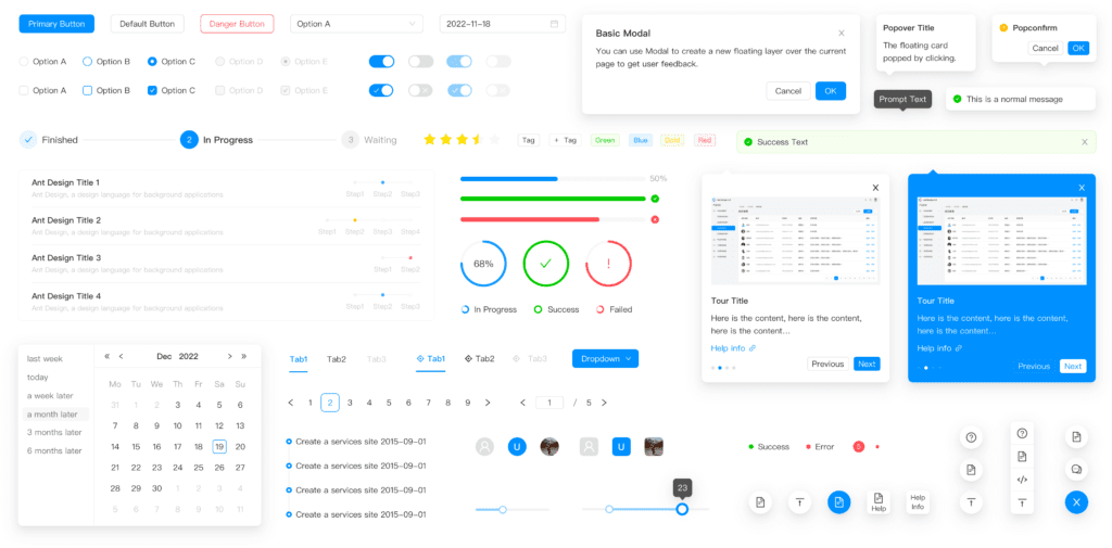
Alibaba Group’s Ant Design is an open-source design system that has gained immense traction among React developers since its launch in 2015. With a variety of prebuilt UI components, the library makes it incredibly simple to ensure uniformity throughout your application without any hassle.
Ant Design stands out from other design systems due to its use of Chinese user interface design principles and guidelines. As a comprehensive library, the system contains an array of components such as form controls, navigation elements, and data visualization tools that are essential for creating beautiful designs with ease.
When it comes to using Ant Design within React projects, the process is straightforward and fully customizable. The library presents a set of hooks and components to be utilized with functional components inside React. Furthermore, you can access a large collection of modification options that allow you to alter the appearance and behavior aspects of these elements as you wish.
To give you a glimpse of how Ant Design works in practice, here’s an example of a basic form constructed with its components:
import React from 'react'
import { Form, Input, Button, Checkbox } from 'antd'

const layout = {
  labelCol: {
    span: 8,
  },
  wrapperCol: {
    span: 16,
  },
}
const tailLayout = {
  wrapperCol: {
    offset: 8,
    span: 16,
  },
}

const ExampleForm = () => {
  const onFinish = (values) => {
    console.log('Success:', values)
  }

  const onFinishFailed = (errorInfo) => {
    console.log('Failed:', errorInfo)
  }

  return (
    <Form
      {...layout}
      name='basic'
      initialValues={{
        remember: true,
      }}
      onFinish={onFinish}
      onFinishFailed={onFinishFailed}
    >
      <Form.Item
        label='Username'
        name='username'
        rules={[
          {
            required: true,
            message: 'Please input your username!',
          },
        ]}
      >
        <Input />
      </Form.Item>

      <Form.Item
        label='Password'
        name='password'
        rules={[
          {
            required: true,
            message: 'Please input your password!',
          },
        ]}
      >
        <Input.Password />
      </Form.Item>

      <Form.Item {...tailLayout} name='remember' valuePropName='checked'>
        <Checkbox>Remember me</Checkbox>
      </Form.Item>

      <Form.Item {...tailLayout}>
        <Button type='primary' htmlType='submit'>
          Submit
        </Button>
      </Form.Item>
    </Form>
  )
}

export default ExampleForm
Background on Material UI

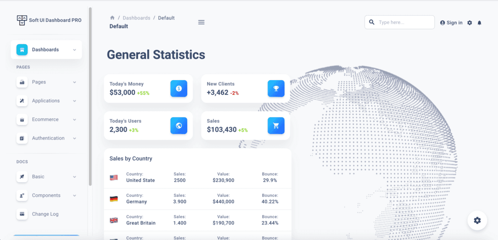
Material UI is an incredibly useful and popular open-source UI library for React projects. Developed by Google on the basis of its Material Design guidelines, it serves as a comprehensive suite of pre-built user interface components. With Material UI, developers can quickly create uniformity and consistency in their applications along with customizable and accessible elements.
The library offers a wide selection of components that are in sync with the Material Design standards. By doing this, your React application not only looks modern and sophisticated but is also up-to-date with the current design trends. These elements include data visualization tools, form controls as well as navigation features, so you’ll have everything to create something truly unique.
Integration with React is seamless and straightforward. Material UI provides a set of custom hooks and components that can be used with React functional components and hooks, making it easy to implement in any React project. Additionally, the library includes a variety of customization options that allow you to adjust the appearance and behavior of components to suit the specific needs of your project.
Here’s an example of a simple form built with Material UI components:
import React, { useState } from 'react'
import Button from '@mui/material/Button'
import TextField from '@mui/material/TextField'

const ExampleForm = () => {
  const [values, setValues] = useState({
    name: '',
    password: '',
  })

  const handleChange = (name) => (event) => {
    setValues({ ...values, [name]: event.target.value })
  }

  const handleSubmit = (event) => {
    event.preventDefault()
    console.log(values)
  }

  return (
    <form onSubmit={handleSubmit}>
      <TextField
        id='name'
        label='Name'
        value={values.name}
        onChange={handleChange('name')}
        margin='normal'
        fullWidth
        required
      />
      <TextField
        id='password'
        label='Password'
        value={values.password}
        onChange={handleChange('password')}
        margin='normal'
        type='password'
        fullWidth
        required
      />
      <Button type='submit' variant='contained' color='primary'>
        Submit
      </Button>
    </form>
  )
}

export default ExampleForm
Comparison of Ant Design vs Material UI
Design Principles
Ant Design and Material UI have distinct approaches when it comes to design principles.
Ant Design’s minimalist and functional design approach provides users with a seamless experience. By strictly following their own set of design guidelines, all components within the library are given an identical look and feel that guarantees consistency throughout. This not only makes for a more efficient user journey but also allows developers to implement Ant Design into their projects without any hassle.
On the contrary, Material UI relies on Google’s visionary Material Design principles. The library strives to offer a cohesive and effortless user experience through its components. Additionally, it focuses on creative thinking and involvement plus encourages front-end developers to use them in new ways for fresh ideas. Furthermore, the library places great emphasis on animation and motion, which provides an exciting user journey.
Ant Design offers a minimalist and straightforward style whereas Material UI brings in more modern ingenuity. What you decide on will be determined by the project at hand and your preferred design aesthetic.
Components and Features
Both Ant Design and Material UI offer a wide range of pre-built components that can be used to build user interfaces. However, they do have some differences in terms of the components and features they offer.
Ant Design offers a wide range of enterprise-level components, such as a data table, a tree structure, and a form builder. It also provides a set of internationalization tools to help developers create multilingual interfaces. The library also has a built-in accessibility system that ensures that all components are usable by users with disabilities.
Material UI, on the other hand, offers a wide range of Material Design-inspired components, such as buttons, cards, and dialogs. It also provides a set of layout and grid components that can be used to create responsive designs. The library also has a built-in theme system that allows for easy customization of the look and feel of the components.
In terms of features, Ant Design has more enterprise-level components and internationalization tools, while Material UI has more layout and grid components and a built-in theme system.
It’s worth noting that both libraries are actively developed and their component offerings may change over time.
Customization Options
When it comes to customizing the look and feel of the components, both Ant Design and Material UI offer different options.
Ant Design provides a set of less variables that can be used to customize the color, typography, and spacing of the components. It also offers a set of theme-less files that can be used to create a custom theme. This allows developers to easily change the look and feel of the components to match their brand or design style.
Material UI, on the other hand, provides a built-in theme system that allows developers to easily change the color and typography of the components. The library also provides a set of CSS classes that can be used to change the spacing and layout of the components. In addition, Material UI also offers a set of React hooks that can be used to customize the behavior and appearance of the components.
Performance and Scalability
Performance and scalability are key factors to consider when choosing a React UI library. Both Ant Design and Material UI have optimized their libraries for performance and scalability.
Ant Design has a focus on performance, and its components are lightweight and fast-loading. The library also employs lazy loading, which speeds up the loading time of components.
Material UI also prioritizes performance, with its components designed to be lightweight and fast-loading. The library uses code splitting and tree shaking to minimize the size of the final bundle and enhance loading time.
When it comes to scalability, both libraries can easily handle large-scale projects. Ant Design offers a wide range of enterprise-level components and internationalization tools, making it suitable for large-scale projects. Similarly, Material UI’s collection of Material Design-inspired components also makes it suitable for large-scale projects.
Learning Curve
When it comes to the learning curve, both Ant Design and Material UI have a relatively steep learning curve. This is because both libraries come with a large set of components and features that need to be understood before they can be effectively used in a project.
Ant Design has a slightly steeper learning curve than Material UI as it comes with a set of strict design guidelines and a wide range of enterprise-level components. This means that developers need to spend more time understanding the design principles, layout and component behavior before they can start building their project. But once you have a good understanding of the library, you can easily make use of the many built-in components and tools it provides.
Material UI has a relatively milder learning curve. The library follows Material Design guidelines which are widely accepted and used in many applications. The library also has a smaller set of components and features that are easy to understand and use.
Popularity
Both Ant Design and Material UI are widely used and popular React UI libraries. However, Material UI is more popular among developers.
According to recent data, Material UI is one of the most popular React UI libraries, with over 2.1 million weekly downloads on npm. It has a large and active community of developers, with over 84k stars on GitHub and many contributors. It’s also has a huge number of third-party packages and plugins that extend its functionality.
On the other hand, Ant Design has nearly 1 million weekly downloads on npm and 83.9k stars on GitHub. Ant Design has a large user base in China, and it’s supported by a team of developers at Alibaba, one of the largest e-commerce companies in the world.
Both libraries have good documentation and a large number of examples and tutorials, making it easy for developers to learn and use them.
Use Cases
When reviewing the use cases of both Ant Design and Material UI, it is clear that they each possess their own unique set of advantages and drawbacks.
Ant Design offers an excellent user experience that is perfect for enterprise-level projects. The consistent design guidelines and accessibility focus make it the ideal option for building applications that will be used by a wide range of users. It’s a good choice if you need multilingual support in your project.
Ant Design has been used in a plethora of real-world cases, especially in Chinese tech companies, such as:
- Alibaba
- Tencent (QQ, WeChat, etc.)
- Baidu
- Xiaomi
- Ele.me
- Taobao
- JD.com
- Tmall
- Ctrip
- Huawei
Material UI is the perfect choice for modern, engaging projects that call for an intuitive user interface. Its components are inspired by Material Design and it puts emphasis on animation as well as motion to offer an experience tailored precisely to your users’ needs. It also lends itself perfectly when you need a responsive design and customizations that can be done quickly and with ease.
There are numerous real-world applications of Material UI, including:
- Google (Google Drive, Google Calendar, Google Maps, Google Photos, etc.)
- Airbnb
- Uber
- Netflix
- Spotify
- Dropbox
- Microsoft (Office 365, Outlook, OneNote, etc.)
- GitHub
- Trello
Pros and Cons
In this section, we will be discussing the pros and cons of using Ant Design and Material UI.
Ant Design
Pros:
- Strict design guidelines ensure a consistent and efficient user experience
- Emphasis on accessibility makes it usable by a wide range of users
- Wide range of enterprise-level components and internationalization tools
- Good performance and scalability
- Large user base in China
Cons:
- Less flexibility in terms of customization
- More minimalist and simple design aesthetic may not be suitable for all projects
Material UI
Pros:
- Material Design-inspired components provide a cohesive and intuitive user experience
- Emphasis on animation and motion makes for a more engaging user experience
- Built-in theme system allows for easy customization of the look and feel of the components
- Good performance and scalability
- More popular among developers than Ant Design
- Large global user base
Cons:
- Less enterprise-level components and internationalization tools compared to Ant Design
- More modern and creative design aesthetic may not be suitable for all projects
Conclusion
In this article, we have conducted a complete analysis of Ant Design and Material UI – two widely-used React UI libraries. We’ve compared their design principles, components & features, customization potentials, performance and scalability, and assessed each library’s use cases before listing out its pros and cons.
Ant Design is the perfect choice for ambitious enterprise-level projects, offering consistent and efficient user experiences, accessibility support, internationalization tools, strict design guidelines, top-notch components and performance optimization.
For creative and engaging projects that need a modern look, Material UI is the perfect option. It offers components inspired by Material Design with an emphasis on animation and motion – plus, it has a built-in theme system for easy customization and outstanding performance.
Carefully consider the individual needs of your project in order to make a sound decision. Both libraries bring their own set of advantages and shortfalls, so the selection between them is contingent on satisfying those particular requirements.
For further reading, we recommend checking out our blog post on the comparison of Chakra UI and Tailwind CSS, two other popular UI libraries. This will give you a broader understanding of the options available and help you decide when choosing an ideal UI library for your next project.
Ant Design is my new favorite one from today.